Library Tools
Many of the questions addressed during Beautiful Data are questions that libraries have been confronting in the context of new ways of structuring and engaging with information. David Weinberger, a guest speaker at Beautiful Data, pointed to several developing tools and prototypes as case studies - including StackLife, Serendip-o-matic, and the Harvard LibraryCloud API.

Gifpop and Meshu
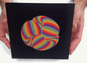
Rachel Binx, one of Beautiful Data's guest speakers, counts Gifpop and Meshu among her projects. Gifpop's website describes it as "a tool to make custom cards from animated gifs, using the magic of lenticular printing." Meshu allows you "to make beautiful mementos from the places that are important to you." Both point to interesting interplays between the physical and the virtual.

Infinite Variety
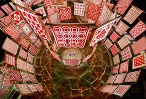
Thinc Design created an installation to display hundreds of quilts in a tiered, circular manner, creating ascending pavilions within a massive exhibition space. The exhibition, which was aimed at creating a moment of open-ended, non-interpreted experience with the quilts, also came to include a mobile app that took a different approach: the app guided users quilt-by-quilt and utilized iPads in the space. The installation and app allowed for unexpected experiences and interactions with materiality and meaning.

Spatial Information Design Lab
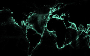
The Spatial Information Design Lab at Columbia has worked on a range of visualization projects; two that Beautiful Data participants discussed with guest speaker Laura Kurgan are Port to Port and There+Here: Transnationalism and Migration.

Hard Times in the OC
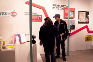
An exhibition at the Oakland Museum of California, Hard Times in the OC, presents one example of community curating. The project, a collaboration between the museum and California State University, Fullerton students and faculty, portrayed a range of experiences and stories that diverge from preconceptions about Orange County. Suzanne Fischer of the Oakland Museum of California discussed the project with Beautiful Data participants.

The Tate Collection
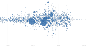
Tate is committed to digitizing its collection, and it has a collections dataset published on GitHub. Examples of the dataset's "use in the wild" are included with the repository on GitHub, and one of these examples is Beautiful Data participant Florian Kraeutli's visualization work with the Tate data.

Metropolitan American Wing
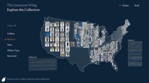
Small Design Firm developed a new approach to technology in the Met’s American Wing, encompassing wayfinding, redesigned labels, and interactive elements that both speak to the size of the wing’s roughly 15,000-object collection and allow visitors to explore this collection in a range of ways. The approach aims to convey the scale and materiality of the objects that make up this collection, putting a creative turn on the idea of transparency.

Cooper Hewitt Collection Interface
Cooper Hewitt's "explore the collection" page offers a range of ways of interacting with the museum's collection: you can explore by color, concordances, people, and various other fields rather than relying on "search." They also have toys to play with, have put their collections database on GitHub, and link their collections information to material from Wikipedia and other collections. Cooper Hewitt's Seb Chan discussed the possibilities of this approach with Beautiful Data participants.

Iconoclashes
Erik Berglin and Clement Valla explain their project, Iconoclashes, on the project's website:
"The starting point of these images is the Metropolitan Museum of Art’s public web archive; specifically all photographs of objects tagged with the keywords ‘God’ or ‘Religion.’
These source images
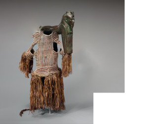
were randomly grouped and digitally merged with a Photomerge script inside Adobe Photoshop. The script is a common algorithm used to stitch separate images together into longer panoramas. In the case of “Iconoclashes,” the script attempts to blend these “God”-tagged images together, creating chimeric deities, hybrid talismans, and surreal stellae, gods and statues.
The “Iconoclashes” appear as a typical cataloging of a museum’s archive. The Met Museum uses standards when photographing their archive— all objects are presented on a generic grey surface, with similar lighting and they all occupy the same percentage of the frame, regardless of scale. The “Iconoclashes” exploit this styling; the photomerge script works only because of this stylistic consistency.
Yet these are not typical museum images; these are not objects that could ever exist. The images are smooth and photoreal, but the space, the colors and the physics simply don’t add up. Their strangeness is the product of an algorithm rather than a human creator."
